Problem
Students have access to trading apps, but financial jargon and unclear portfolio information make decisions difficult. Many want to invest but feel unsure where to start.
Investing, made easier to understand.
An ETF-focused brokerage concept for college students aged 18–24, developed by a 4-person team. As UI/UX lead, I developed screen hierarchy, wireframes, prototypes, and UI refinements. I conducted 2 interviews, coded responses, and reconciled coding differences with Natalie. Together, we interviewed 8 students, surveyed 10 undergraduates, and used feedback from 5 students to refine the experience.
Students have access to trading apps, but financial jargon and unclear portfolio information make decisions difficult. Many want to invest but feel unsure where to start.
Combine clear portfolio insights, beginner-friendly learning, and financial goals with a guided ETF purchase flow, keeping information close to the decision.
Interviews with 8 college students and a survey of 10 undergraduates identified a shared barrier: understanding financial information, even when investing tools were available.
“I like visual dashboards that show how my portfolio changes over time.”
Interview 2
“I’d like a tool that breaks investing into steps for beginners without jargon.”
Interview 1
“I track my net worth as a way to measure progress toward independence.”
Interview 2
Anonymized excerpts from the supplied interview-coding file.
College sophomore balancing coursework, studying, and a part-time campus job.
Interested in investing, but unsure she has time to learn alongside her classes.
College senior with an internship and automatic investment deposits; discusses career goals with family and friends.
Knows a little about investing, but wants a less involved process.
Understand performance and risk. Students wanted visual dashboards to understand changes over time. Pair performance charts with plain-language risk and diversification insights.
Learn without financial jargon. Lack of knowledge was the leading survey barrier. Bring step-by-step education into the investing flow, close to each decision.
Track long-term progress. Interviewees linked net worth to independence. Make goal progress visible and support contributions that fit student income.
The chosen low-fidelity direction explored performance, learning, trading, and discovery. Goal-setting develops further in the interactive prototype.
Green and blue establish a finance-focused direction: green references growth, while blue supports the intended sense of trust and stability. White space and dark text keep financial data readable. League Spartan headings and Archivo body text provide a clear hierarchy without adding complexity for beginners.
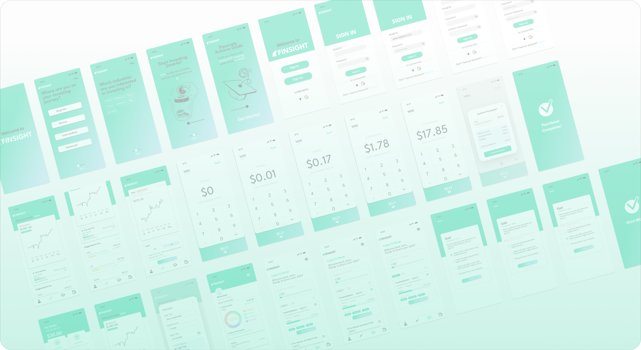
Performance, learning, and goal-setting became connected screen flows. The prototype includes onboarding, ETF purchases, lessons, and financial goals.
Think-aloud sessions with 5 students revealed unclear actions, purchase information, and hidden goals. These before/after UI comparisons show the resulting refinements.
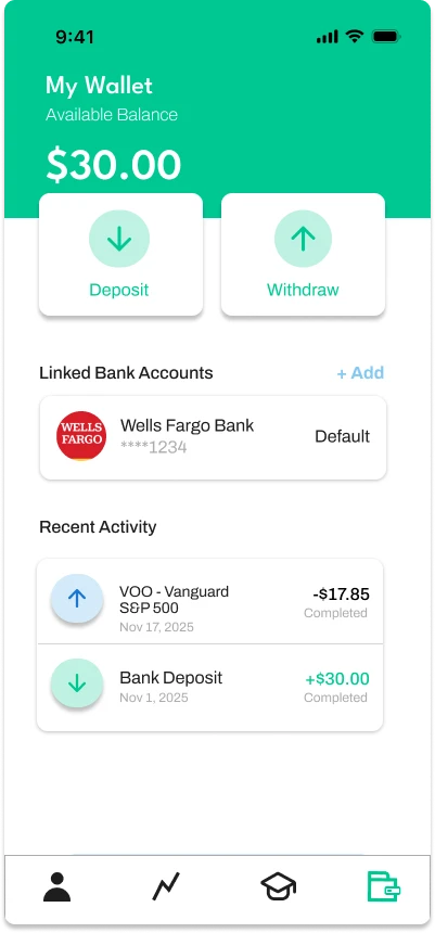
Wallet balances and account activity.
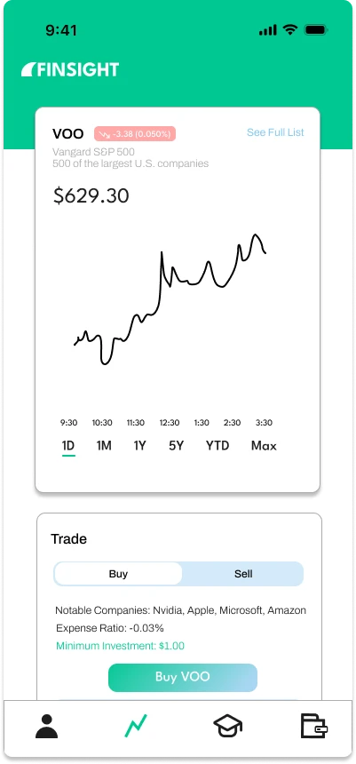
Market information and purchase actions.
Goals and account details.
Education within the investing experience.